My entry for the Hive Book Club Graphic Design Contest 🖍📖
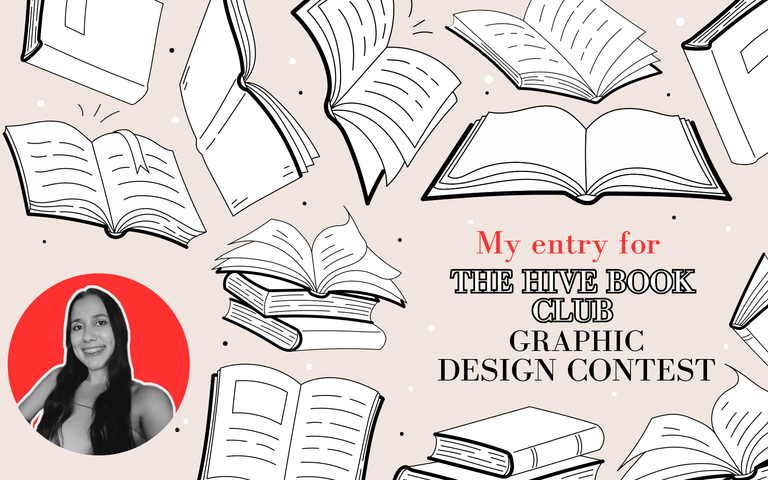

Hi everyone! One of the communities that I like the most here at Hive is Hive Book Club, I participate quite a lot there and I also know how to design, so I thought, why not try to participate in their contest that seeks to change the design of their community?, so here I am.
The current design of the community is pretty nice, but a change is always welcome. Particularly I'm a person of various tastes, I don't have a defined style so in order to create my proposals I focus on what I know is currently working when creating a visual identity, a little of my personal tastes and the old design of the community. I hope my proposals will be appreciated, I have a lot of fun making them.
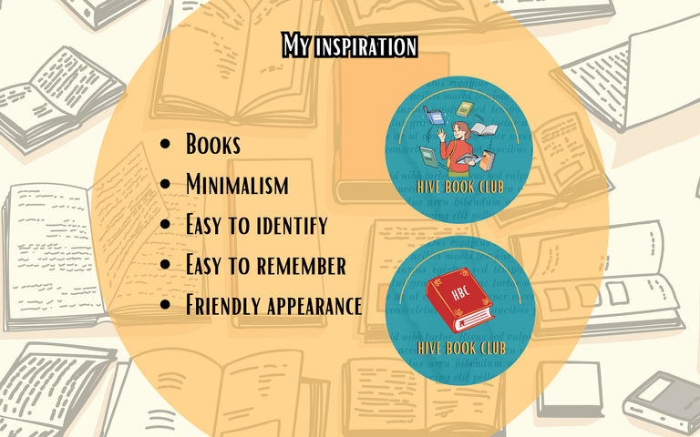
My inspiration
Books: Does this need any explanation? (lol) As this is a community that focuses on books, it's basic that one of my foundations to create the whole aesthetic are the books, so that's what you'll see everywhere so there's no doubt about anything.
Minimalism: We all have our own tastes, but there is no denying that minimalism is the trend nowadays, especially when it comes to creating an identity for something, taking that into account I wanted to create a minimalist aesthetic, but without losing the colorfulness of the previous design of the community.
Easy to identify: Following the concept of minimalism, an aesthetic or personal brand should be easy to identify, it should not be the same as any other, even if it has one or another similarity. In this case, I know that a rebranding should not be so drastic, since users are already familiar with the previous aesthetics, so although my design is different, I made sure to leave some similarities with the previous one so that users continue to identify the community.
Easy to remember: It's important that the aesthetics is easy to remember, too many colors, letters or images can be visually overwhelming for some people, that's why the simpler but more precise our aesthetics is, the easier it will be to remember us, of course, as I mentioned above, this will depend on the tastes of each person, but it is advisable to keep everything simpler.
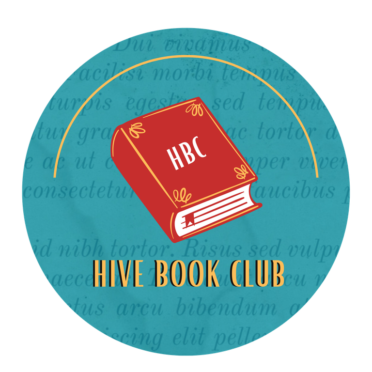
Friendly appearance: Books come in different genres, so choosing an aesthetic that applies to all book genres can be complicated, considering that and that the Hive Book Club community is pretty friendly, I wanted to make a design that represented that, so that's why in the first logo I wanted to place a smiling person with several books around and in the second one a pretty simple book.
Suggested
Colors by
the community
Source
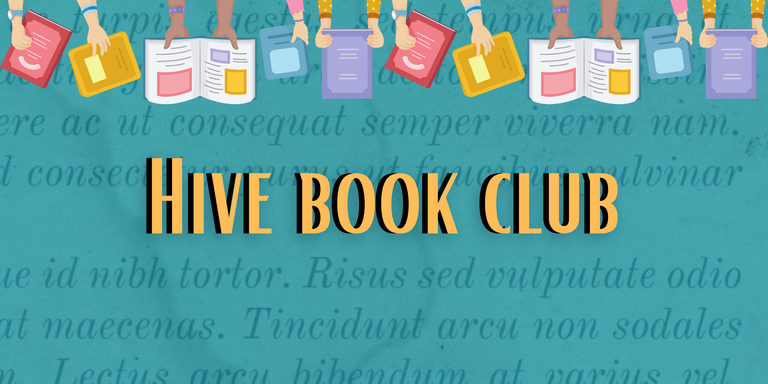
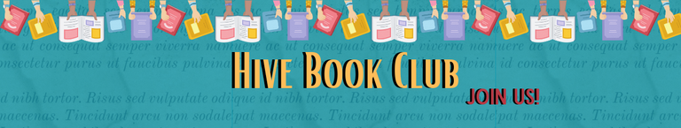
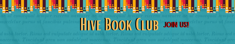
Design proposal number 1

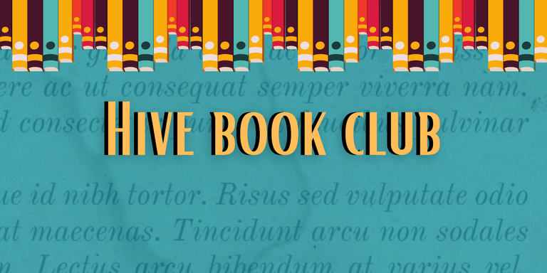
Design proposal number 2

The designs I have presented here are only two of the many that I came up with, they may be subject to modifications if necessary or I can even make others, I mention this in the hypothetical case that the community likes my proposals, but want to make some changes or try other things. A graphic identity is something very important, so it has to be chosen meticulously.
Thanks to all who read me and like my designs, graphic design is one of the things I am good at and enjoy doing. ❤️
"Reading is one of the best things a human being can do to learn, relax, entertain himself, expand his mind, travel without moving his body and simply have a good time. Having a book is a special feeling that only the most passionate readers appreciate. If you mix these two things you create a wonderful experience that can be shared here at Hive Book Club, an experience that I love to be part of"- Valeria Valentina.
(Damn, Am I a poet? 🤣)
Header, banners, separator and images
created and edited by me with Canva Pro.
└────── •• ──────┘
https://inleo.io/threads/valeriavalentina/re-leothreads-2csxbrpst
The rewards earned on this comment will go directly to the people ( valeriavalentina ) sharing the post on LeoThreads,LikeTu,dBuzz.
I really attest to the friendly look your design has. It is attractive as well. I love the design. Hopefully, it will be considered.
This post has been selected by the Hive Learners Community team and will receive support from the lazypanda. Kindly click on the banner to visit our community and check out our Discord channel here.
Thank you for the support! I'm glad you liked the friendly style, I also hope it will be taken into consideration hehe
Your design is beautiful, you nailed it with the choice of colour, it's simple but eye catchy.
If I was to choice, I will go with the design proposal one.
Thanks a lot, I'm glad you think it's beautiful!
That derivation of the turquoise color certainly stands out and, personally I also liked the first design hehe
I would like to express my appreciation for this well-crafted article.
I believe has done a great job in highlighting the importance of minimalism and how less can be more in terms of design. The idea of simplifying and making things more precise and easily identifiable is truly valuable, especially in an visually overwhelming environment. Additionally, the images are highly captivating, and I enjoyed them as they captured my interest.
Your appreciation is very much welcomed, I'm happy you liked it!
Minimalism is the key nowadays for an attractive design, too much visual load can become overwhelming and this is coming from a person who sometimes likes things over the top hahaha. Thanks so much for expressing yourself so nicely about my designs, a hug for you!
Your designs may come up to be the best. Well-done and it's a nice job you have done....