Week 344-Splinterlands Art Contest - Infernal Firestorm
Hello, Everyone!
I'm thrilled to share my new entry for the Splinterlands Art Weekly Contest 344. Each week, I'm amazed at the skill coming through the Hive community, and it's an honor to be among such a focused and creative crowd.
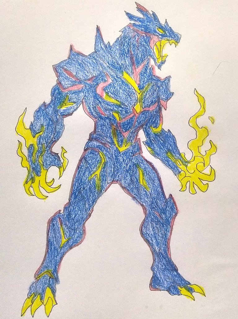
This time, I ventured into a world of elemental fury and primal strength to bring you this furious elemental monster. Towering in strength, this monster seethes with raw power its electric claws burn with raw lightning, and its thick armor carries glowing veins of power. The bold color contrast of blue, yellow, and pink brings to the surface the raw power that flows through this monster, as if hatched from storm and flame.
With its snarl of horror, spiky spikes, and prepared stance to tear asunder all that you see, this champion is chaos and strength rolled into one. I envisioned a being created by ancient storms, a guardian of the elemental rift, who unleashed devastation with holy intent. Every line and color was carefully selected to reflect its kinetic energy and pulverizing strength.
Massive thanks to Splinterlands for continuing to challenge creatives to let their imaginations get free and wild! Wishing all the amazing creators in this round the best of luck keep driving your vision beyond the horizon!
Week 344
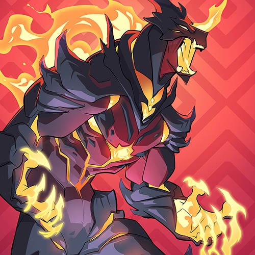
Today Art Card: Infernal Firestorm
How to Draw of Infernal Firestorm
Keep an eye out for how it Draw
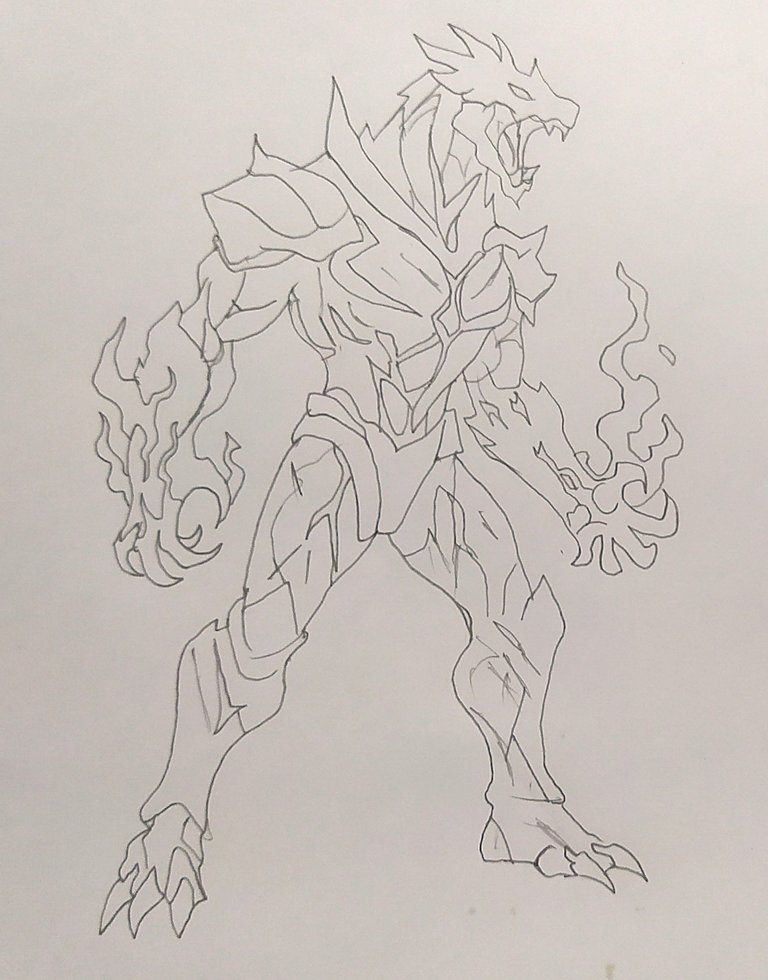
The drawing was made in my hand
with .....
Necessary Materials
1. Pencil
2. Color Pencil
3. Poster Color
4. Round beads (multicolored)
6. Round beads small (black)
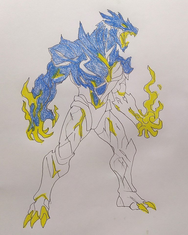
See The First look
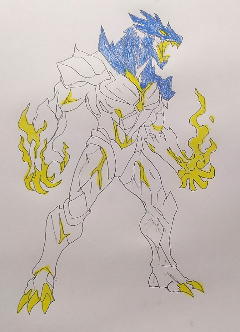
See next look

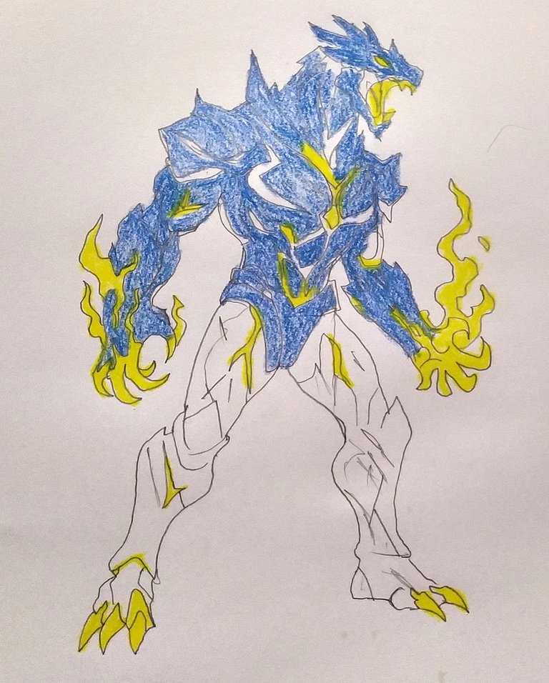
See next look
See next look
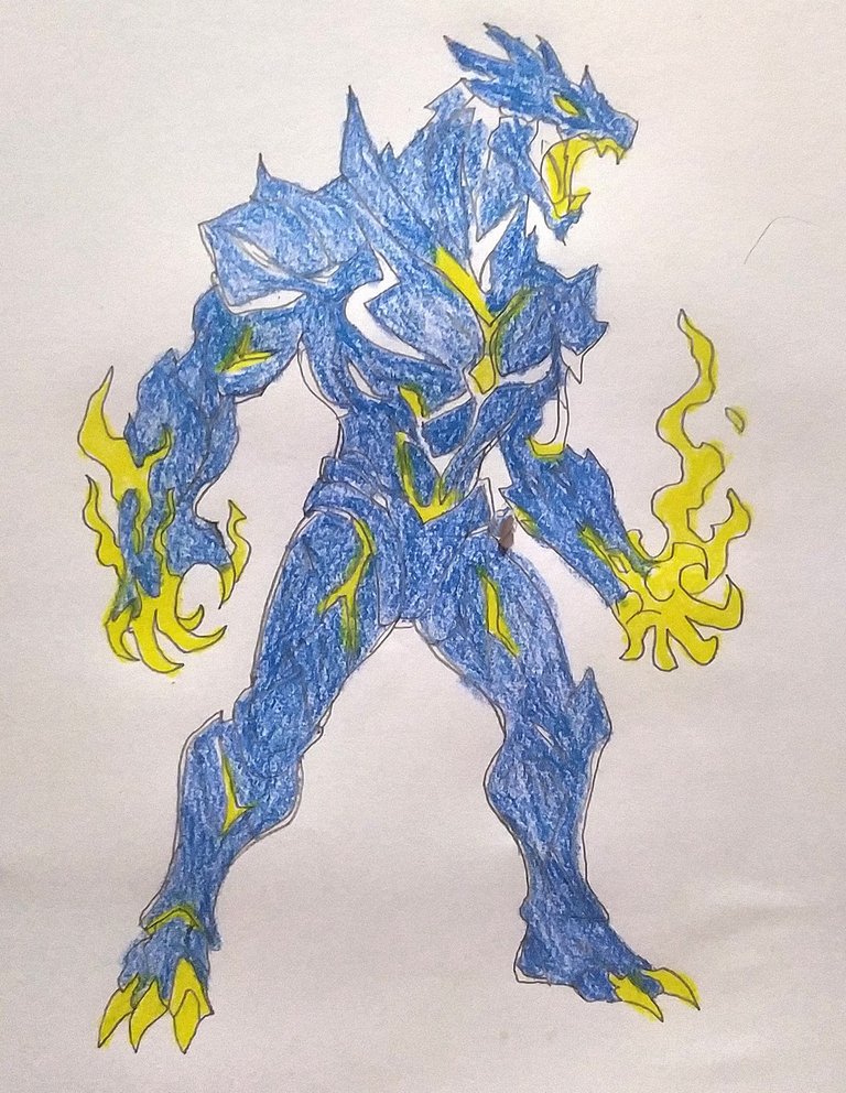
See next look
See next look
See next look
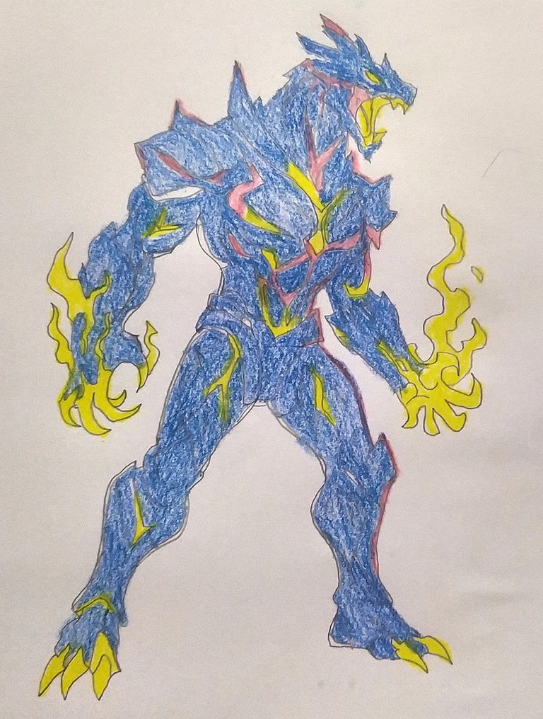
See The Final look
thanks please Hit the up-vote button if you like this post and leave a comment if you wanna say anything about this post I will participate next Splinterlands Art Contest
Good Luck to all of you
That's all for now. I'll come with an interesting post again.
"About Me""

Generally...
I'm a housewife, I like to draw pictures, I can do a lot of design work and help my husband at our design firm
Thank you to all.
I recommend that you apply a little more pressure to the crayon to give that extra effect to your drawing so that the porosity of the hour is not noticeable, you look amazing