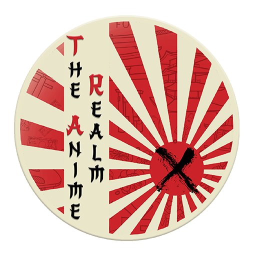
My proposal for The Anime Realm Logo - @Maitt87
Greetings to all the enthusiasts of The Anime Realm community! It's a pleasure to share my debut in this community that has always shined for its high quality anime-related content. On this occasion, I'm excited to submit my entry to the community logo design contest.
Being relatively new to the world of anime, I ventured out to seek inspiration and knowledge to create a logo that would adequately reflect the spirit of this community. My main source of inspiration came from the rich symbols of Japanese culture, the birthplace of anime.
Japan is known around the world as "the land of the rising sun". This name originated when one emperor wished to engage with another and started a letter with the words "From the Emperor of the Rising Sun". So I decided to incorporate a red sun into my design, as this symbol represents prosperity, abundance and joy in Japanese culture. The sun is considered the light that illuminates the darkness of the world.
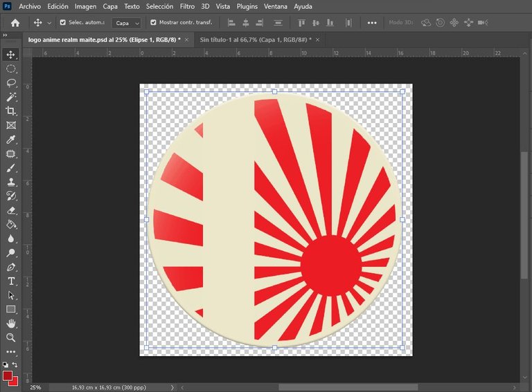
With this inspiration in mind, I turned to Photoshop to shape my ideas. I started by creating a pearlescent circle and applied bevel and embossing effects to make it stand out against the background. Next, I worked on rendering the sun using the brush tool.

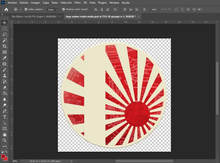
My goal was to integrate the sun's rays into the circular shape I had previously created, leaving a white border to define the boundaries. To give them a touch of authenticity, I searched for elements of Japanese culture on the Freepik platform and added them with low opacity.
As a lover of textures in design, I decided to incorporate a grunge texture to add a touch of dynamism to the image.
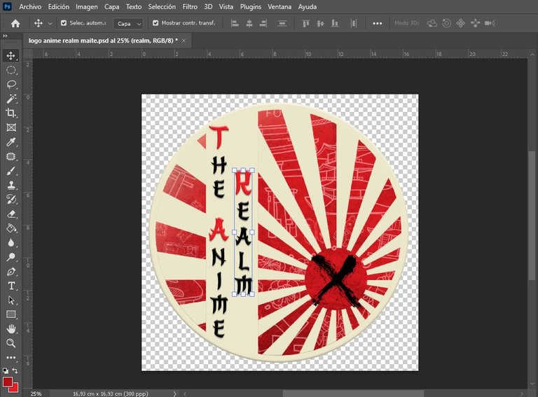
To give a nod to the community, I added an X in the logo, both as a tribute to the current community logo and in honor of an anime series that captured my attention: Rurouni Kenshin.

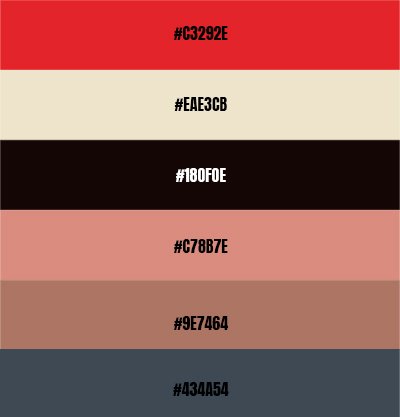
Finally, I included the community name in an oriental-style font and kept the colors I had used throughout the design. I also share the color palette that can be used in conjunction with this logo.
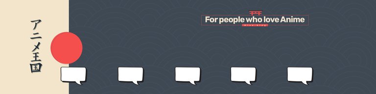
As for the cover image of the community, I opted for a more sober approach, using the color schemes provided by the design palette. Standing out on the cover, I wrote the name of the community in Japanese and added a slogan at the top right. The dialog boxes on the back are intended for subscribers, active users, interactions and all the valuable information the community offers.
I also present to you a small divider I designed using the community logo and distinctive lines.

To be honest, I greatly enjoyed the creative process behind this logo. I hope you liked my work and that this initiative will attract more people, inspiring us to create great works together, let's make this anime passionate community grow!

Consulted Sources
All the elements used in this logo are free to use.

Seems nice. It’s so similar to the old Japanese flag during the war.
Yes, that's because this flag is used by the Japanese empire. Although I wanted to emphasize the raising sun simbolism.
Thanks for passing by.
Hi, welcome to the contest! This is a very interesting proposal, we really like the way you reflect the rising sun in the logo. Regarding the main image, the colors are very nice.
Thanks for taking the call and for participating!
The truth is that I had a lot of fun participating and also by researching, one acquires more knowledge. Designing is something that relaxes me a lot, so this contest was a perfect fit. Thanks to the community for the opportunity.
If there's a symbol that represents the Japanese culture is the rising sun. I really like this flag, so I'm loving your proposal. The color palette is very elegant and the asian font complements the logo perfectly.
Great job.
Thank you friend, I'm glad you liked this proposal. It is nice to know about Japanese history and culture and to be able to contribute with this design for the refreshment of the community. Thanks for your support.
Thank you for participating in the contest! See you soon!
Oh, I hope to see great designs in this contest. Thanks for giving me the opportunity.
Not only did I like their logo, but I also liked the specifics of the logo creation.
Excellent color palette and logo details.
Best of luck in the contest.
Thanks my friend, it's good to know that you liked this idea, it's simple but it covers many things that I particularly like. Thanks for your support.
Maite the logo was super brutal, the X in the sun looks awesome, in fact I imagined it (the logo) in badges and it would be great for merchandise; besides you made a separator that was very nice and I loved the cover image, it was very creative with the dialogue boxes, the slogan and the transcription of The Anime Realm to Japanese, that was a great move, my sincere congratulations 🌹💖!!!!!
I just came from seeing (late) Rosana's design, I loved both proposals; I wish you many successes in the contest friend 🙌😀💛.... You Rockkk!!! 👍😎🔥❤️
Thank you very much for your support, it's good to know that this idea I had was to your liking, it was a little challenge because I'm very new in the anime world and I wanted to reflect something really particular of this whole world.
I know we will see great proposals. Thanks for always being my dear friend.
quedo genial, me encanta como se refleja la imagen de un sol. Suerte!
It looks great, I love how it reflects the image of a sun. Good luck!
Thank you very much for your support, it's always good to receive good critics about a design. Thank you.
I loved it, no doubt the sun placed in this way immediately evokes Japan. I found the texture in the rays to be an extraordinary addition.
I really liked the explanation of your process. Excellent.
I am a fan of textures, I feel that somehow they give life to the designs, I don't like them to be so flat and that was something I wanted to reflect in this design. Thank you for stopping by and for your support.
It was great, very good combination of colors and design, really enhances the Japanese style and would be very nice as a logo of the community 👌
I wish you success in the contest ❤️
Thank you very much for your appreciation, it's good to know that you think it would be great as the logo of this great community, we'll see how the contest ends, I know we'll see great proposals. Thanks for your support.
I really liked the detail of the logo of the comma added too. The colors are perfect for the logo. great job
Fascinates me. The design is charming 😍 Good luck in the contest 😊
Thank you very much, and thank yoy for passing by.