Re:diseño by Pandiseño - #7 | Encuentro Nacional de Biodanza
 Español
English

Una de las prácticas que hago como diseñador para mantenerme activo, es rediseñar y corregir logos que veo en cualquier lugar, mucha gente asocia el corregir con arreglar algo que está mal, pero rediseñar implica realizar modificaciones desde una posición personal y basado en conocimientos y gustos parcializados, en este caso los míos.
Hace mucho tiempo que no llevaba a cabo un post de esta serie, donde he tenido la oportunidad de practicar con @el-panal y @la-colmena, donde intente refrescar la imagen de @ladiesofhive, @Freewriters, @hivefood y el más polémico de todos el del usuario @iksumanera, donde explicaba un poco sobre el plagio al usar partes de un logo registrado.
Hoy, quiero aprovechar la iniciativa de @holos-lotus en la cual abren un concurso público para diseñar un logo para su tercer Encuentro Nacional de Biodanza, y con esto más que trabajar un Rediseño, vamos a crear algo desde cero explicando un poco mi proceso de creación.
! [English Translation] One of the practices I do as a designer to stay active, is to redesign and correct logos that I see anywhere, many people associate correcting with fixing something that is wrong, but redesigning involves making changes from a personal position and based on knowledge and biased tastes, in this case mine. That said, I want to clarify that the purpose of this post is not to attack, or damage the image of the parties mentioned, nor to profit with that image.
It has been a long time since I had a post in this series, where I have had the opportunity to practice with @el-panal and @la-colmena, where I tried to refresh the image of [@ladiesofhive](https://peakd. com/hive-148441/@jossduarte/rediseno-by-pandiseno-2-ladies-of-hive), @Freewriters, @hivefood and the most controversial of all from user @iksumanera, where I explained a bit about plagiarism when using parts of a registered logo.
Today, I want to take advantage of the initiative of @holos-lotus in which they open a public contest to design a logo for their third National Meeting of Biodanza, and with this more than working a Redesign, we are going to create something from scratch explaining a little my creation process.
Quiero que se entienda algo y es que el trabajo como diseñador no se basa en el dibujito, no estás pagando por un par de líneas digitales y agregarles color, lo que el diseñador te está vendiendo es un servicio basado en el funcionamiento, la trascendencia, lo que ha estudiado y lo que sabe que podría funcionar para ti y tu marca.
! [English Translation] I want you to understand something and that is that the work as a designer is not based on the drawing, you are not paying for a couple of digital lines and add color to them, what the designer is selling you is a service based on performance, transcendence, what he has studied and what he knows could work for you and your brand.
| 20% Diseño | 40% Investigación | 40% Vender un concepto |
|---|---|---|
| 20% Design | 40% Research | 40% Storytelling |
Como le decía a alguien ayer, es muy poco lo que necesitas saber dibujar o dibujar algún programa para diseñar, un buen diseñador pasa poco tiempo en esta etapa y a medida que adquieres experiencia el tiempo se reduce, pero tenemos un porcentaje de importancia en investigación que es realmente lo que se cobra, el tiempo invertido en estudiar una marca, su público, el cómo hacerla funcionar y captar toda su esencia, finalizando entonces con vender una historia, un concepto, explicarle al cliente como hacer funcionar su marca, su logo, como mostrarse al público, más que un logo los diseñadores como yo creamos lo que es un lenguaje entre una marca y quienes van a consumirla.
Dicho esto y desde el respeto, luego de participar hace un par de años en el concurso de un juego para la plataforma y ver el sistema que utilizaron, yo decidí no participar más de estas competiciones; Pero, en el caso de @holos-lotus la invitación es a que participen, incluso si no llegan al día final de entrega (08 Sep), porque considero que para los inexpertos es una oportunidad de probarse a sí mismos, y para quienes tenemos experiencia una oportunidad de mantenernos activos en todo momento.
! [English Translation] As I was saying to someone yesterday, it is very little that you need to know how to draw or master any program to design, a good designer spends only a short time in this stage and as you gain experience the time is reduced, but we have a percentage of importance in research that is really what is charged, the time invested in studying a brand, its public, how to make it work and capture all its essence, ending then with selling a story, a concept, explaining to the client how to make his brand work, his logo, how to show himself to the public, more than a logo, designers like me create what is a language between a brand and those who are going to consume it.
Having said that and from respect, after participating a couple of years ago in the contest of a game for the platform and seeing the system they used, I decided not to participate in these competitions anymore; But, in the case of @holos-lotus the invitation is to participate, even if you do not reach the final day of delivery (08 Sep), because I consider that for the inexperienced it is an opportunity to prove themselves, and for those who have experience an opportunity to stay active at all times.
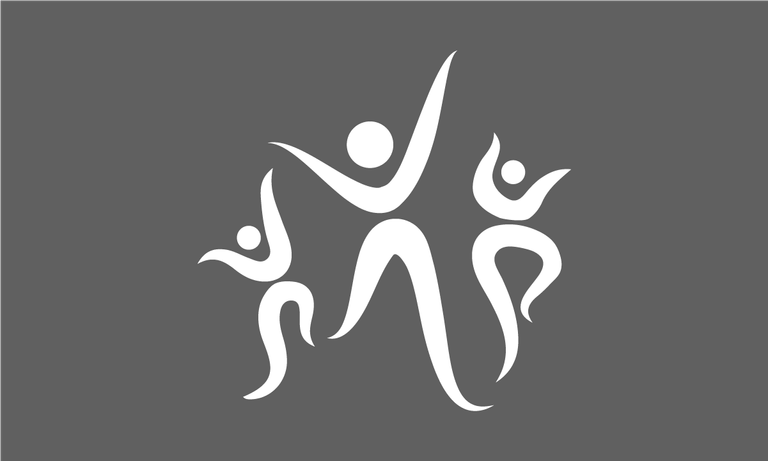
Como dijeron los pollos, vamos al Grano. Lo principal es comenzar a estudiar el concepto que nos dan, en el caso de la BioDanza es un concepto que conozco bien, ya que la practique por años cuando aún vivía en Venezuela, conozco sus beneficios, conozco su concepto, conozco su público y entiendo lo que se quiere expresar cuando se habla de Biodanza; Algo que me desagrada personalmente, es que ya sea por decisión de los diseñadores o gustos personales, estas imágenes suelen ir encaminadas a un público femenino, y como alguien que participó en Biodanza y dejando de lado el juicio, les aseguro que llega un punto donde a pesar de integrarte y formar parte, los varones nos encontramos con una barrera visual que dificulta el entender que la Biodanza es para todos.
Sabía que quería un logo adaptable, llamativo, con movimiento y unisex, capaz de usarse tanto en formatos digitales, como bordarlos en una camiseta, estamparlos en una prenda, crear un llavero con ello o imprimirlos, representando a su vez la danza, la vida (Bio), la humanidad y una palabra bastante clave que aunque no se usa en el nombre con este sentido, para mí tiene mucho peso y es Encuentro, ya que aunque la Biodanza se puede practicar en solitario, la energía que compartes al encontrarte a ti mismo y verte en otros mientras danzan, es simplemente mágico.
! [English Translation] As the chickens said, let's get down to the Grain. The main thing is to begin studying the concept that is given to us, in the case of BioDanza is a concept that I know well, since I practiced it for years when I still lived in Venezuela, I know its benefits, I know its concept, I know its public and I understand what they want to express when they talk about Biodanza; Something that displeases me personally, is that either by decision of the designers or personal tastes, these images are usually aimed at a female audience, and as someone who participated in Biodanza and leaving aside the judgment, I assure you that there comes a point where despite integrate and be part, men we find a visual barrier that makes it difficult to understand that Biodanza is for everyone.
I knew I wanted a logo that was adaptable, eye-catching, with movement and unisex, able to be used in digital formats, such as embroidered on a T-shirt, imprinted on a garment, create a keychain with it or print it, representing at the same time dance, life (Bio), humanity and a very key word that although it is not used in the name in this sense, for me it has a lot of weight and is Encounter, because although Biodanza can be practiced alone, the energy you share when you find yourself and see yourself in others while they dance, is simply magical.

Una vez ya tenía claro el concepto, y luego de un boceto que esta vez hice directamente en Illustrator, encontré a través de dos trazos al cual les aplique anchura y un círculo sencillo, la representación de una persona en movimiento, de una persona danzando; Si bien es un concepto simplón, quería que así lo fuese, sé que pueden identificar un cuerpo en ese icono; sin embargo, les aseguro que no pueden definir si es chico o chica, si es alto o bajo, si es gordo o flaco, y es que mi intención con hacer la figura tan simplificada está en que pueda representar a todo aquel capaz de danzar.
Me gustaba el concepto, pero a medida que me alejaba del computador para verlo y tratar de darle mejoras a la línea, evitando líneas poligonales que desentonaran, se me cruzo nuevamente la palabra encuentro y como ya dije, la importancia de compartir la energía de la Biodanza con otros, por lo que decidí que mi personaje no debería estar solo y al ser tan sencillo trabajar con una forma tan básica, el crear dos acompañantes fue cuestión de utilizar la herramienta pincel y dibujar esta especie de bigotes que luego moldearía para crear otro par de cuerpos.
! [English Translation] Once I had the concept clear, and after a sketch that this time I did directly in Illustrator, I found through two strokes to which I applied width and a simple circle, the representation of a person in movement, a person dancing; Although it is a simplistic concept, I wanted it to be so, I know that you can identify a body in that icon; however, I assure you that you cannot define if it is a boy or a girl, if it is tall or short, if it is fat or skinny, and my intention with making the figure so simplified is that it can represent anyone capable of dancing.
I liked the concept, but as I moved away from the computer to see it and try to give improvements to the line, avoiding polygonal lines that clashed, I crossed again the word encounter and as I said, the importance of sharing the energy of Biodanza with others, so I decided that my character should not be alone and being so simple to work with such a basic form, creating two companions was a matter of using the brush tool and draw this kind of mustaches that would then mold to create another pair of bodies.
Paré de inventar en esta etapa porque sabía que iba a perder tiempo puliendo y creando, además de que realmente creo que más elementos solo harían menos legible la imagen, por lo que tocaba ir a encontrar una fuente para el texto que acompaña el logo, necesitaba algo con movimiento, pero fácil de leer y como la mayoría de las fuentes que utilizo para mis logos, una fuente bajo licencia abierta que permita su uso en cualquier proyecto. Fue entonces que encontré en GoogleFont Kaushan Script de la gente de Impallari Type, una fuente básica bonita, con movimiento y fácil de leer, con un grosor correcto para pantallas y que funciona bien incluso a 12Px
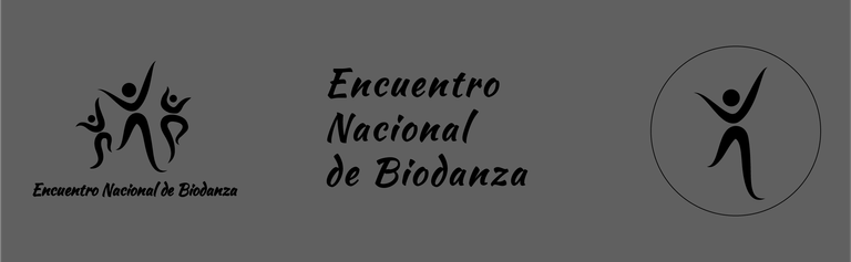
Llegada esta etapa teniendo ya texto e icono, quería hacer el logo en tres partes, isologotipo que vendría siendo la mezcla de texto e icono, el icono solo que es ideal para avatares de redes sociales, stickers e insignias, y el texto solo que es muy usado en formatos impresos, todo esto con la idea de que teniendo una única imagen cualquier persona con acceso a ella tenga distintas maneras de llevar el Encuentro Nacional de Biodanza a su público.
! [English Translation] I stopped inventing at this stage because I knew I was going to waste time polishing and creating, plus I really think that more elements would only make the image less readable, so I had to find a font for the text that accompanies the logo, I needed something with movement, but easy to read and like most of the fonts I use for my logos, a font under open license that allows its use in any project. It was then that I found in GoogleFont Kaushan Script from the people of Impallari Type, a nice basic font, with movement and easy to read, with a correct thickness for screens and that works well even at 12Px.
At this stage having already text and icon, I wanted to make the logo in three parts, isologotype that would be the mixture of text and icon, the icon alone that is ideal for avatars of social networks, stickers and badges, and the text alone that is widely used in print formats, all this with the idea that having a single image anyone with access to it has different ways to bring the National Meeting of Biodanza to your audience.
Hasta esta etapa siempre trato de trabajar en blanco y negro sobre el fondo gris de Illustrator, pensar en color en etapas tempranas del diseño, personalmente lo considero una distracción, pero una vez que ta tengo los elementos lo primer que hago es irme a Adobe Color y comenzar a explorar paletas de colores.
Luego de darle muchas vueltas y pruebas, me decidí por una paleta de tres colores, el principal que es el Violeta Claret de código #641D39 y RGB (100, 29, 57), un Verde Manzana código #8DB600 y valores RGB (141, 182, 0), y por último como no me gusta utilizar el Blanco puro, me fui por un Gris Brillante con código #EAEBEE y valores RGB (234, 235, 238), aunque también está el negro puro que aunque no lo utilicé, probé que funciona bien para la identificación de los elementos.
! [English Translation] Until this stage I always try to work in black and white on the gray background of Illustrator, thinking about color in the early stages of the design, I personally consider it a distraction, but once I have the elements the first thing I do is to go to Adobe Color and start exploring color palettes.
After a lot of thinking and testing, I decided on a palette of three colors, the main one being Claret Violet code #641D39 and RGB (100, 29, 57), an Apple Green code #8DB600 and RGB values (141, 182, 0), and finally as I don't like to use pure White, I went for a Bright Gray with code #EAEBEE and RGB values (234, 235, 238), although there is also the pure black that I didn't use, but I proved that it works well for the identification of the elements.

Y así fue como logré crear mi participación para el Encuentro Nacional de Biodanza, un logo que más allá del concurso y dejando de lado toda la competencia, fue beneficioso para mi experiencia personal, considero que se lee bien, se puede utilizar en distintos elementos, es fácil de modificar, y aunque quizás no es tan colorido como a otros les gustaría, logré lo que personalmente quería representar y es el concepto de que la Biodanza es para todos, agregando colores neutros y mucho movimiento en los elementos.
Antes de despedirme, agradecer a @miriannalis quien me hiciese la primera invitación para participar, y extendiendo tanto a diseñadores como aquellos que no lo sean a que se atrevan, a fin de cuentas y siendo totalmente sincero, más que clientes o premios en #Hive, sé que como yo hay un montón de diseñadores dispuestos a compartir su experiencia, sus conocimientos y guía para todo aquel que de buena forma la busque.
Y con esto me despido, gracias por llegar hasta aquí.
! [English Translation] And that's how I managed to create my participation for the National Meeting of Biodanza, a logo that beyond the contest and leaving aside all the competition, was beneficial to my personal experience, I think it reads well, can be used in different elements, is easy to modify, and although perhaps not as colorful as others would like, I achieved what I personally wanted to represent and is the concept that Biodanza is for everyone, adding neutral colors and lots of movement in the elements.
Before I say goodbye, thank you to @miriannalis who made me the first invitation to participate, and extending to both designers and those who are not designers to dare, after all and being totally honest, more than clients or awards in #Hive, I know that like me there are a lot of designers willing to share their experience, their knowledge and guidance for anyone who in a good way looking for it.
And with this I say goodbye, thank you for being here.
! [Descargo de responsabilidad] Las imágenes fueron editadas por mi persona en Adobe Photosho
Prohibido compartir este o cualquiera de mis contenidos en cualquier Red social con la intención de ganar POSH.
Wuao que maestría gracias por compartir tu diseño 🥰 y feliz que haya sido nuestra Biodanza lo que te motivo para volver a presentar tu arte. Feliz cumpleaños @jossduarte
Me gusto mucho como quedo el diseño final, y estoy en total de acuerdo al principio, que rediseñar no es corregir algo que "esté mal" aunque siempre lo toman así. Exelente trabajo
Impecable... aquí muestras con claridad como se debe hacer un logo en manos de un profesional.

Saludos
@tipu curate 5
Upvoted 👌 (Mana: 25/75) Liquid rewards.
Congratulations @jossduarte! You have completed the following achievement on the Hive blockchain And have been rewarded with New badge(s)
Your next target is to reach 29000 upvotes.
You can view your badges on your board and compare yourself to others in the Ranking
If you no longer want to receive notifications, reply to this comment with the word
STOPCheck out our last posts: