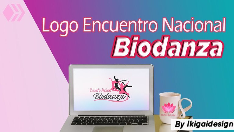
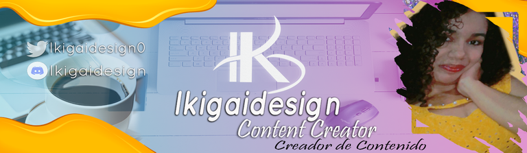
Concurso: Logo Encuentro Nacional de Biodanza [ESP-ENG]
Amigos de #HiveArte, hoy me uno a la iniciativa propuesta por la comunidad de @holos-lotus, la cual nos pide que creemos un logo, relacionado con el próximo Encuentro Nacional de Biodanza.
Friends of #HiveArte, today I join the initiative proposed by the @holos-lotus community, which asks us to create a logo, related to the next National Biodanza Meeting.
Les cuento que yo no sabía de su existencia, el arte de la Biodanza, un término que era desconocido para mí, pero a medida que me puse a ver los videos y post compartidos por parte de la comunidad, he ido entendiendo un poco de que se trata y lo que realizan en estos encuentros, la verdad se nota que es una hermosa experiencia, interactiva, creativa, divertida, amena, relajante, sin duda vale la pena participar en ella.
La Biodanza no es más que una actividad donde un grupo de personas se reúnen, y a través de la música, con movimientos generan la capacidad de desarrollo y autoconocimiento, me da curiosidad, porque no tienes que ser un experto en el baile, es simplemente dejarte llevar por el ritmo, por lo que sientes en ese momento, como dije una experiencia de autodescubrimiento de emociones, sentimientos, relajación, en fin, muchas cosas más, que vas viviendo en el momento.
Cuando vi la iniciativa, dije bueno a mí me gusta diseñar, siempre he dicho que no soy una profesional, sigo siendo una aprendiz, pero para eso estamos para aprender, crear, y dejar volar nuestra imaginación, es por ello que igual forma quise poner mi granito de arena, y ver que me salía.
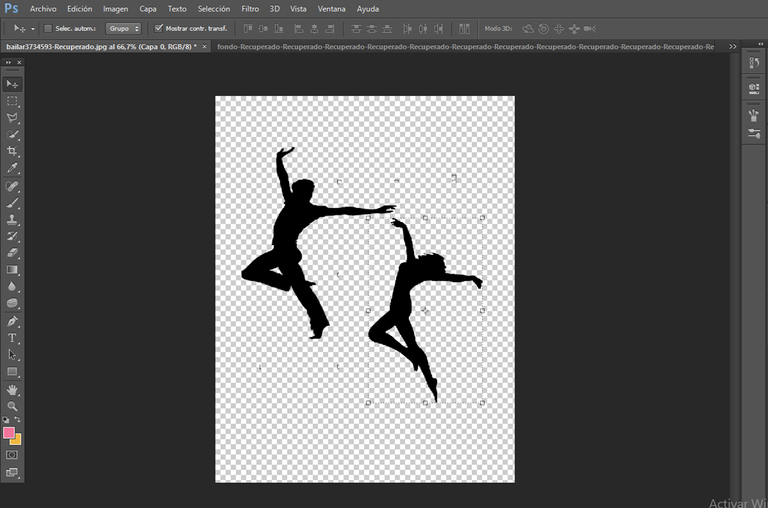
Como ya le mencione, la Biodanza es un encuentro de baile, entre varias personas, por eso empecé mi diseño con la unión de estos dos géneros, hombre y mujer, (cabe señalar que el programa que yo utilizo para mis diseños es Photoshop), por eso busque la silueta de ambos, como ven en la imagen.
ENGLISH VERSION
I tell you that I did not know of its existence, the art of Biodanza, a term that was unknown to me, but as I started to watch the videos and post shared by the community, I have been understanding a little of what it is and what they do in these meetings, the truth is that it is a beautiful experience, interactive, creative, fun, enjoyable, relaxing, certainly worth participating in it.
Biodanza is nothing more than an activity where a group of people get together, and through music, with movements they generate the capacity for development and self-knowledge, it makes me curious, because you don't have to be an expert in dance, it is simply letting yourself be carried away by the rhythm, by what you feel at that moment, as I said an experience of self-discovery of emotions, feelings, relaxation, in short, many more things, that you are living in the moment.
When I saw the initiative, I said well I like to design, I have always said that I am not a professional, I am still an apprentice, but that's why we are here to learn, create, and let our imagination fly, that's why I wanted to do my bit, and see what I could come up with.
As I mentioned, Biodanza is a dance meeting, between several people, so I started my design with the union of these two genders, man and woman, (it should be noted that the program I use for my designs is Photoshop), so I looked for the silhouette of both, as you can see in the image.
Por otra, parte, he aprendido que para realizar un logo, no hay que sobrecargarlo con tantos colores, figuras, mientras más sencillo y minimalista, mejor, en eso me base, por ello solo tome una imagen que reflejara de alguna forma lo que vendería este logo, que es el baile, y por supuesto el nombre.
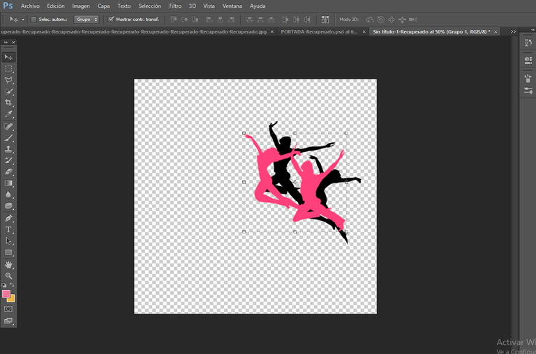
Ya decidido esto, procedí a realizar mi logo, aquí hice esta unión, como de un grupo, ejecutando un duplicado de capa de las siluetas de los géneros, con un detalle, buscando también basarme un poco en el color de logo de la comunidad de Holoslotus, quise hacer esta tonalidad, con dos colores.
ENGLISH VERSION
On the other hand, I have learned that to make a logo, it is not necessary to overload it with so many colours, figures, the simpler and minimalist, the better, that's what I based it on, so I only took an image that reflected in some way what would sell this logo, which is the dance, and of course the name.
Once decided this, I proceeded to make my logo, here I made this union, as of a group, executing a duplicate layer of the silhouettes of the genders, with a detail, also looking to base myself a little on the colour of the logo of the Holoslotus community, I wanted to make this tonality, with two colours.
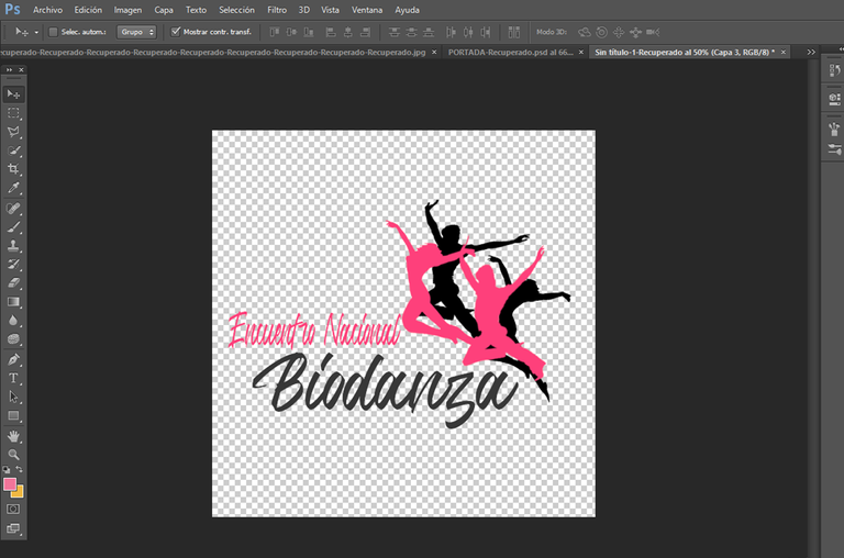
Ahora la parte, si me costó decidir, fue en la tipografía, para ello debemos buscar un estilo entendible, llamativo, sencillo, versátil, ni tan exagerado, ni tan modesto, por eso les digo, que me costó, y les confieso que en esta parte, es donde más indecisa soy, porque hay letras muy bonitas, y uno piensa todas les quedan bien, pero no, aparte de que lo recomendable en este tipo de logos, es utilizar uno, a lo mucho dos tipos de letras, para no confundir, tomen nota chicos jaja.
Bueno, después de tanta indecisión, tome esta, creo que de alguna forma también da ese estilo de danza, una tipografía para logos versátil.
ENGLISH VERSION
Now the part, if it cost me to decide, was in the typography, for this we must look for an understandable style, striking, simple, versatile, not so exaggerated, not so modest, so I tell you, that cost me, and I confess that in this part, is where I am more indecisive, because there are very nice letters, and one thinks they all look good, but no, besides that it is advisable in this type of logos, is to use a single type of letters, not to confuse, take note guys haha.
Well, after so much indecision, I took this one, I think that somehow it also gives that style of dance, a versatile typography for logos.
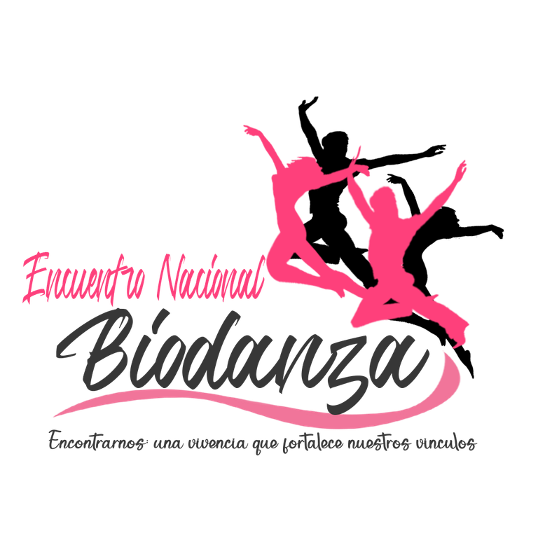
Como les comente, algo sencillo, sin mucho texto, y gráficos, de igual forma le coloque unas líneas curvas, y el lema, aunque creo que no es necesario, pero bueno, allí lo probé a ver como le quedaba, solo como toque final, pero creo que asi, estaba bien, bueno, ya aquí es gusto del cliente si quiere dejarlo asi o no.
As I said, something simple, without much text, and graphics, in the same way I put some curved lines, and the slogan, although I think it is not necessary, but well, there I tried it to see how it was, just as a final touch, but I think it was fine, well, and here is the customer's taste if you want to leave it like that or not.
Pues bien chicos, hasta aquí lo dejo, espero les guste, es algo sencillo, básico, pero creo que de alguna forma refleja el sentir de esta actividad, espero algún día poder asistir a un encuentro como este, se ve que es una bonita experiencia, una gran terapia, y bastante falta que me hace, bueno todo a su tiempo.
Well guys, I'll leave it here, I hope you like it, it's something simple, basic, but I think it somehow reflects the feeling of this activity, I hope someday to attend a meeting like this, it's a nice experience, a great therapy, and I need it a lot, well everything in time.
|  |
|---|
| RECURSO / RESOURCE | FUENTE / SOURCE |
|---|---|
| Imágenes / Pictures: | laptop Mockup |
| Translation/Traducción: | DeepL Traductor |
| Edition/Edición : | Cover and banner with Photoshop /Portada y banner con Photoshop |
Te quedó super super precioso el logo, me encantan los colores y la disposición , genial @ikigaidesign ❤️
Muchas gracias amiga, me alegro de que te gusto, saludos.😍
Me encanta amiga!, quedó muy lindo!
Muchas gracias!!
@tipu curate 3
Upvoted 👌 (Mana: 20/70) Liquid rewards.
Quedó hermoso el logo🤍 transmite mucho movimiento y ligereza. Me encanta el contraste entre el negro y rosa ;)
Si esa era la idea, me alegro de que te guste, saludos.
me encantó tu logo, tampoco conocía el término biodanza, dónde puedo conseguir más información sobre esa actividad? me llama la atención
Gracias amiga, bueno yo tampoco sabia de esto, me entere por la comunidad, puedes entrar en ella y ver los videos que han compartido, en #holoslotus, y bueno aquí en nuestra ciudad creo que no hay nada de eso, seria super verdad jii
Mientras mas sencillo mejor, aquí está una genial propuesta de diseño #art #hive #posh
https://twitter.com/LaYenyen27/status/1700509954208051666?s=20
Gracias amiga, por el apoyo, me alegro de que te guste, saludos.
Quedo espectacular. Se ve super profesional en serio. Felicidades.