My Submission To Hive Book Club Graphic Design Contest
It's nice to be here in the Hive book club community. This would be my first time stopping by in this community and I have been a novel lover. I just bumped into this contest and I decided to partake in it in my way.
Designing a logo, divider, and banner is something one can do but takes a little time if you want to make it unique. I tried to bring out something out of nothing. I have been trying to make all these these and today I just decided to pour my quota down to everyone and in the community at large to feel my designs. I'm not perfect but I just tried to make something to my taste. I wouldn't know if it would be the community's taste, but whichever way, it's a contest that everyone needs to try just to get the best. The community needs the best and I wish everyone partaking in this contest the b st of luck.
Let's get to business
The colors I used would be the first thing to mention as it is important to bring this out.
Classic Blue (main color)
Red Orange
Dark blue
Dark grayish violet
Snarky Mint
Muddy light magenta (twilight)
I'm the type who loves colors and I have a great love for classic Blue so I decided to use it as the main color in the designs.
Going by the look of things, the present logo of this community has a finely designed font. It has something like a handwritten font, but I decided to use something different and also a combination of handwritten.
I used:
gladiola
Grand Cru S
The seasons
Bukharin script
Bodoni FLF
Dm Sans
AR Peristal Mincho JIS
All these fonts are the ones I cherish badly and so I couldn't stop, but use them in combination.
Tasks Given
I have been talking since without bringing my designs forward. Now the next is to show you my first design which is the logo.
LOGO
My logo design is a 6-inch diameter circle. I made it in three folds just in case one design is rated more than the other just because of the inner image I used. I decided to use the hive logo to encrypt the HBC logo I designed.
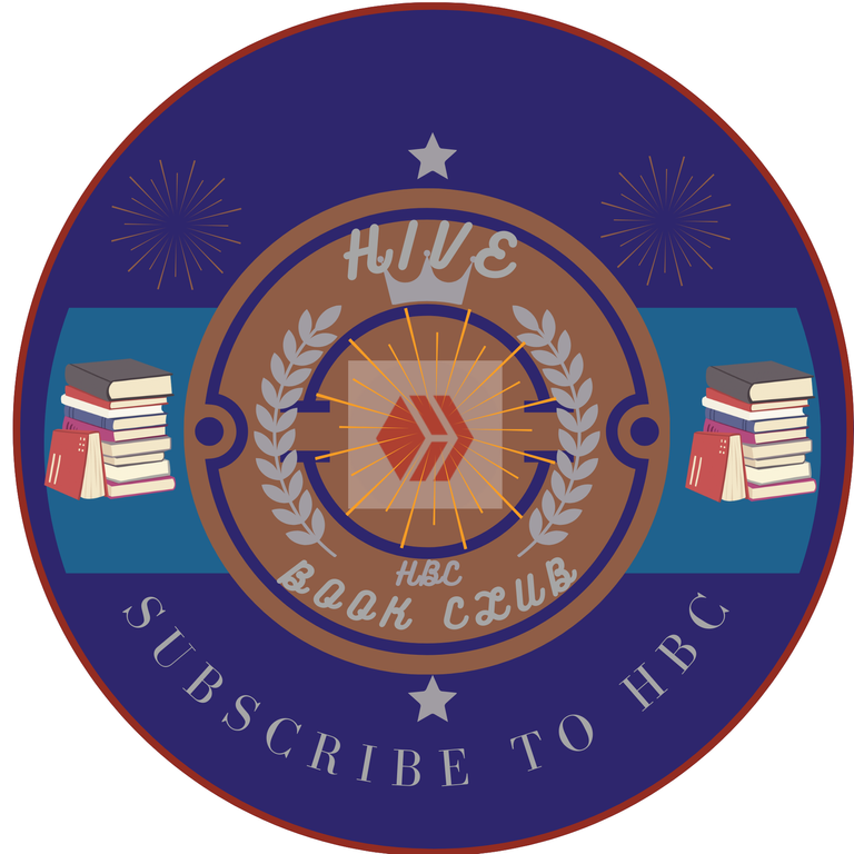
In the logo, I placed a sparkling element by the two top sides of the logo and in the middle.
At the left and right corner are another element I chose (books packed together). Since the community is based on books, nothing is stopping me from inserting this book element into it.
I also placed two similar flowers in between the outer and inner circles. I placed it to make it look somehow unique.

I felt if this was not welcome, then, I had to replace the hive image with a sparkling element and I decided to encrypt the HBC in it. It also makes it look different from the initial.
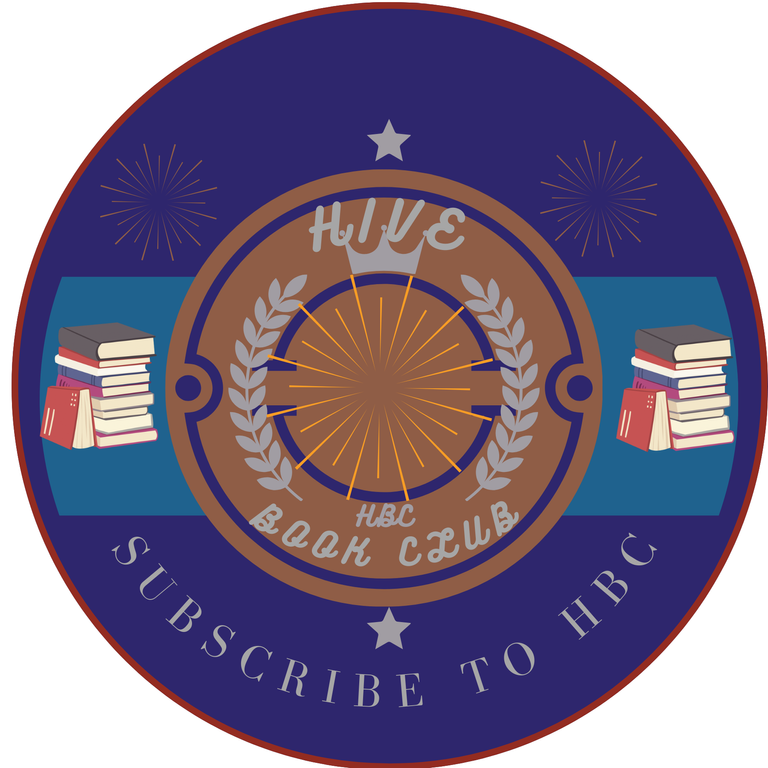
In another way, I decided to remove the sparkling element and left it empty. I think it looks good.
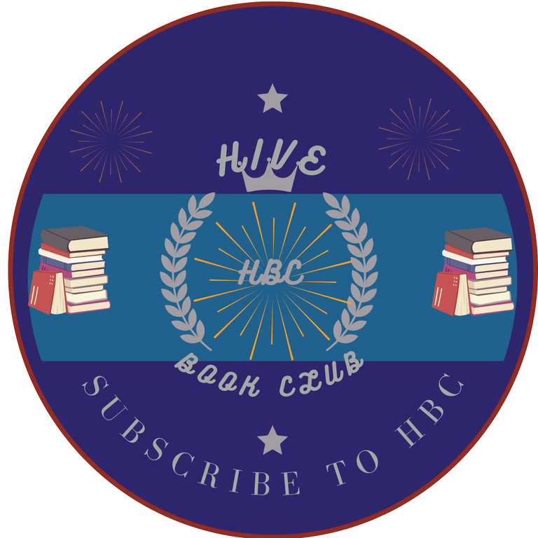
In another form, I removed the circles and allowed them to remain flowing just with the flowers with the HBC well encrypted in the middle.
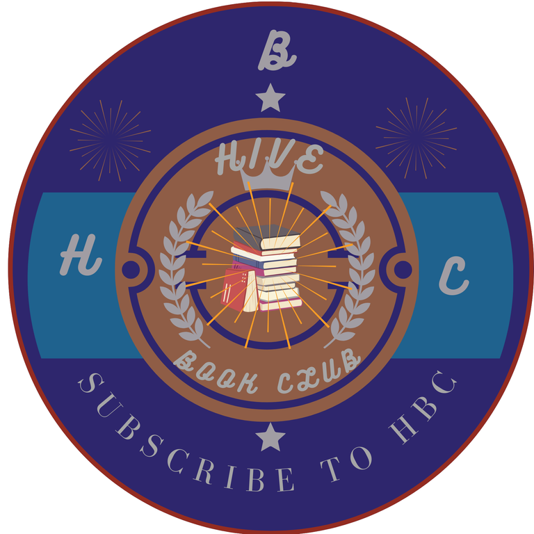
The last one is the design with a book in the middle and the symbol, HBC placed around the design.
My best design and the one I would love to choose would be the first design.
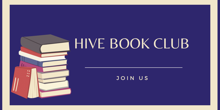
BANNER
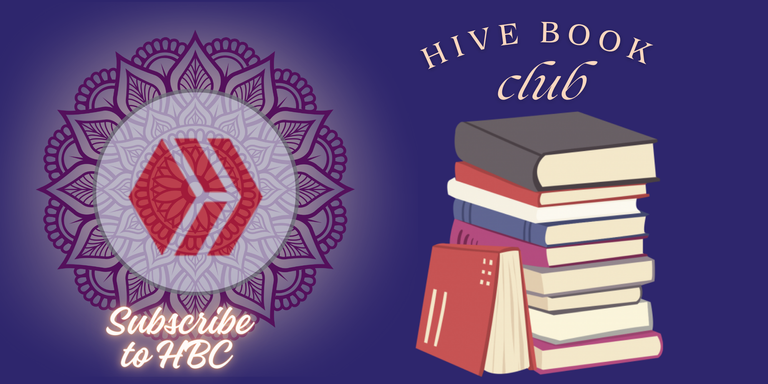
For the banner, I decided to use the same books used in the logo. I think the books would make it look just special as the name of the community implies. The Hive logo is also encrypted in the middle showing that the community exists on the Hive platform.
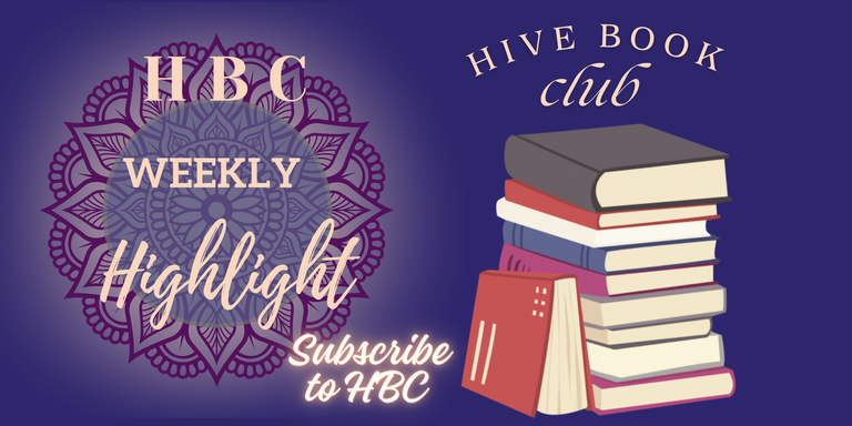
I changed it by removing the hive logo from it and placing HBC weekly highlights as this is what the community just started some days ago. So, I inserted the weekly highlights.
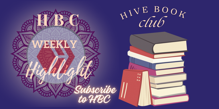
I also replaced the hive logo in place and still maintained the weekly highlights.
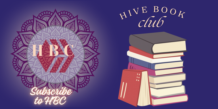
The last one is the hive logo with an HBC well written on it.
In all, the best I would choose is the one without the hive logo which has the weekly highlights, and the one with the hive logo which does not have the weekly highlight. I think this one can be used for some other post.
DIVIDER
The divider logo is also in three forms. I decided to make it three just because of the different forms I would love to use. Upon all, I still have likeness for one.

The one with the hive logo and books besides.

The one without a hive logo, but books in the middle and beside.

And the one with just a book in the middle and books beside it.
In all, I still love the one with books in the middle and without hive logo.
Should in case of any trivia, I decided to prepare the one above.
All images are created on conva by me
You can participate HERE
Thank you for participating! nice entry :)
You are welcome
Nice entry, best of luck. 👍😊
Thanks a lot
I love seeing classic designs such as this.
Great designs.
I should enter the contest too as I know a thing or two about designs.
You inspired me. Hehe😀
Zeegirl 🌻